•
November 2024
•
4
min read
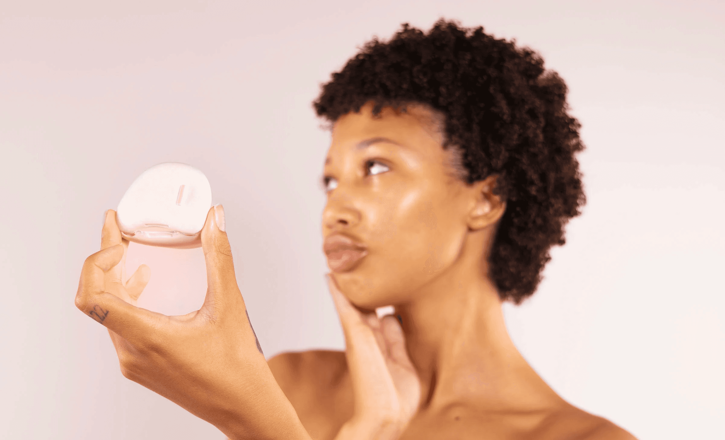
Portable device that predicts how skin will react to products before they're applied
MY ROLE
Product Designer
Graphic Designer
DURATION
10 weeks
TOOLS
Figma, Figjam, Rhino, KeyShot, ChatGPT, Perplexity
COLLABORATORS
Taylia De Freitas, Daniel Wong, Hridhay Mahesh, Zhenghao Zhang
0
users tested across both the app and physical device
0%
of participants understood the product’s purpose and felt confident using it after user testing iterations
0
major design iterations made based on usability insights from testing
Recognition
Silver Winner x8
Mobile App
Mobile Responsive Design
UX, Interface & Navigation
UX, Interface & Navigation for Games for Digital Design
Apps for Digital Design
Product or Gadget Design for Social Change
Product or Gadget Design for Digital Design
Interactive Design for Digital Design
Indigo Design Awards 2025
Challenge
PROBLEM STATEMENT
Despite advancements in skincare technology, most consumers lack an accessible and affordable way to analyze their skin's real-time conditions and reactions, leading to adverse reactions, wasted products, and overconsumption in the skincare market.
EXISTING USER PAIN POINTS
Overwhelmed by too many skincare options
Influenced by unreliable sources like social media
Wasted money on products
Trial-and-error approach to skincare
Lack of access to personalized skincare guidance
Skin appearance causes insecurity
OUR GOAL
Create a seamless, science-backed skincare experience that makes informed choices effortless and accessible.
Research
RESEARCH GOALS
MAIN RESEARCH GOAL
Identify common sources of confusion and frustration in users’ skincare journeys.
SUBGOAL #1
Understand how users choose skincare products and what/who may influence those decisions.
SUBGOAL #2
Explore user expectations and desires for skincare predictive technology.
METHODS
8
in-depth user interviews
107
survey respondents
14
usability tests
Survey insights
20%
of users struggle to find products that work for their skin.
20%
of participants waste money on products they never finish.
20%
of participants wanted a way to predict skin reactions before buying a product.
USER PERSONAS
Based off our research, we were able to create 2 user personas:
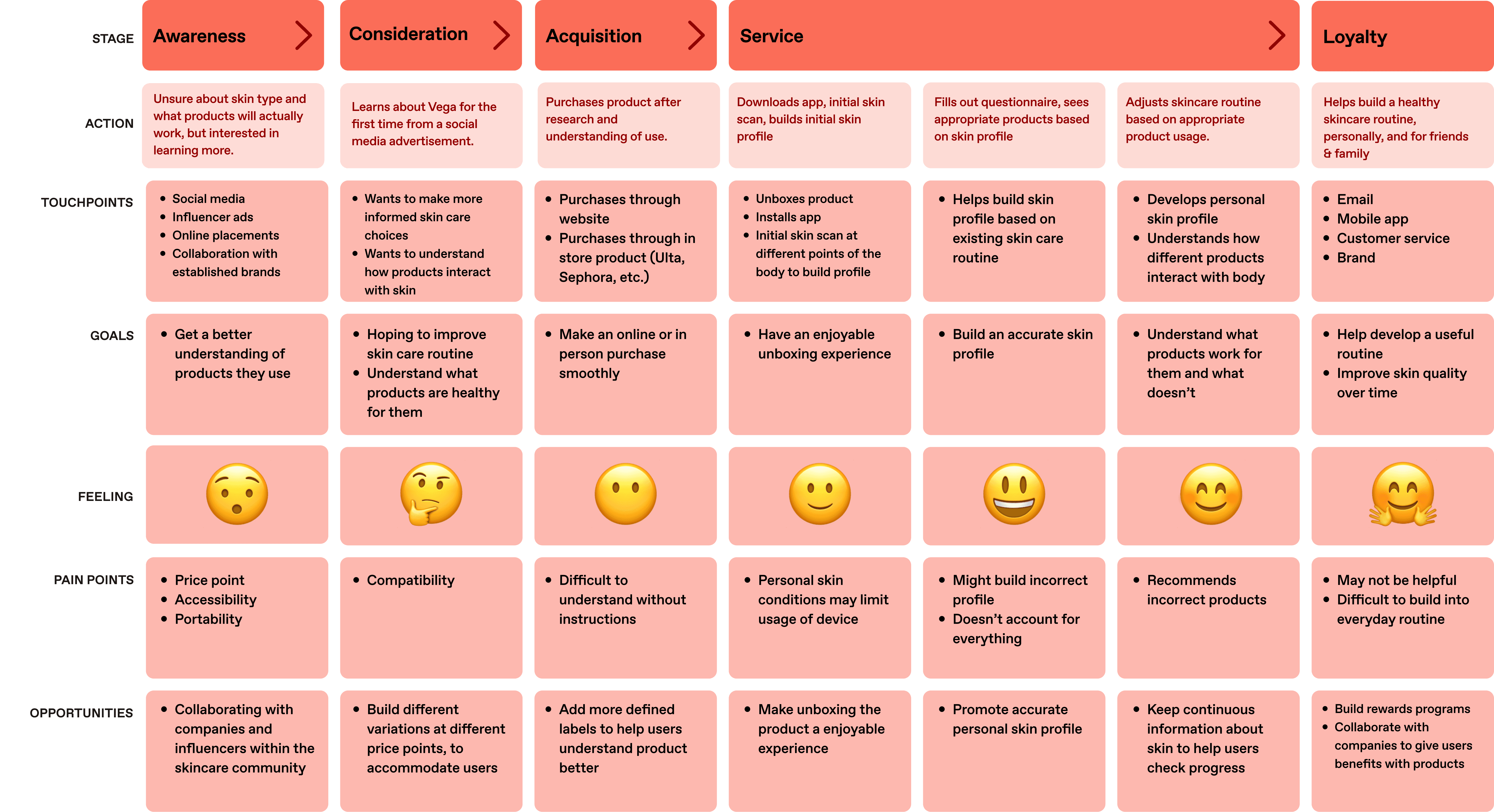
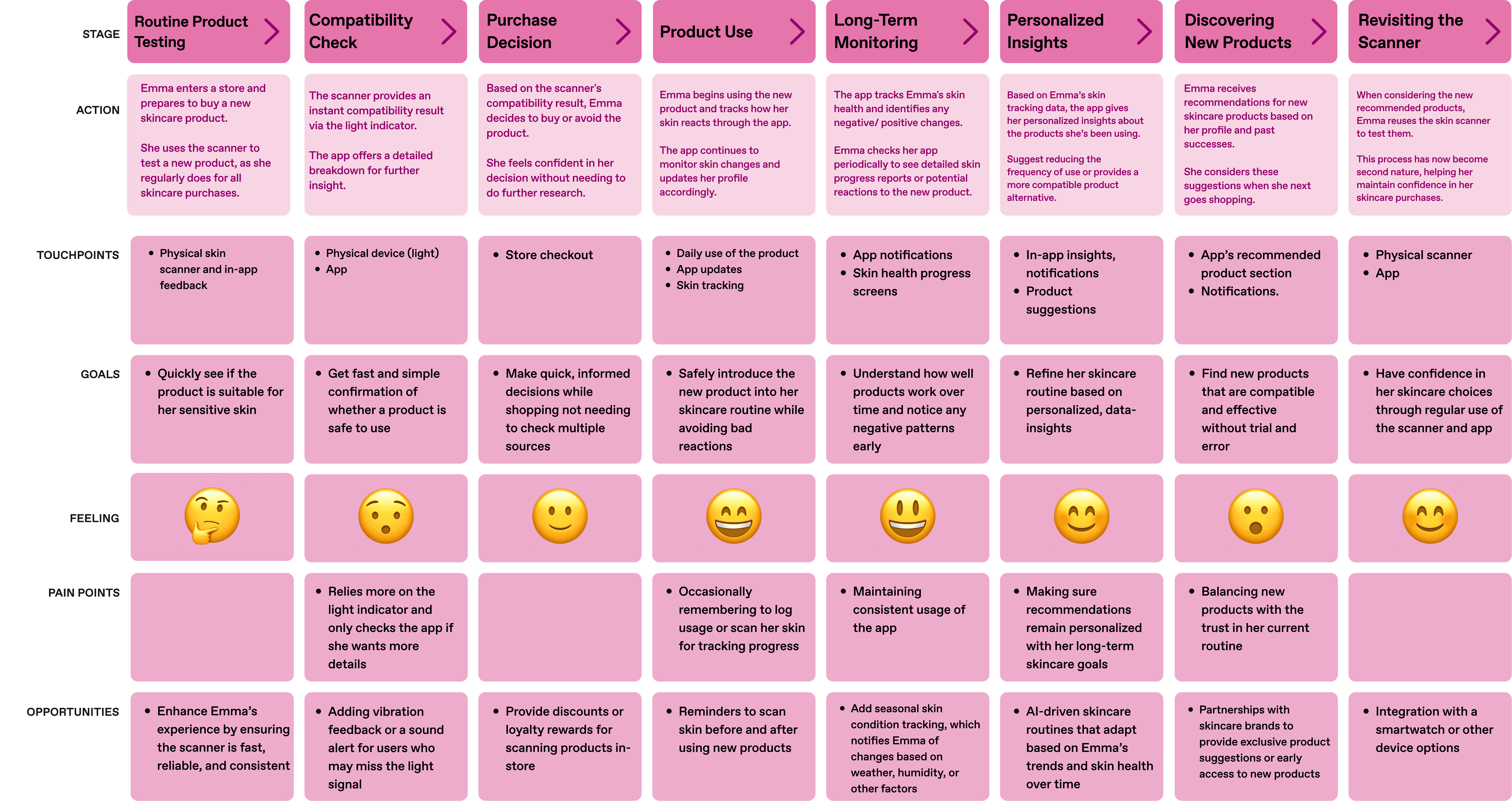
USER JOURNEY MAP
Holistic journey
Product journey
?
HOW MIGHT WE…
empower people to confidently navigate their skincare journey without being swayed by unreliable trends?
create a sustainable, informed approach to beauty?
Development
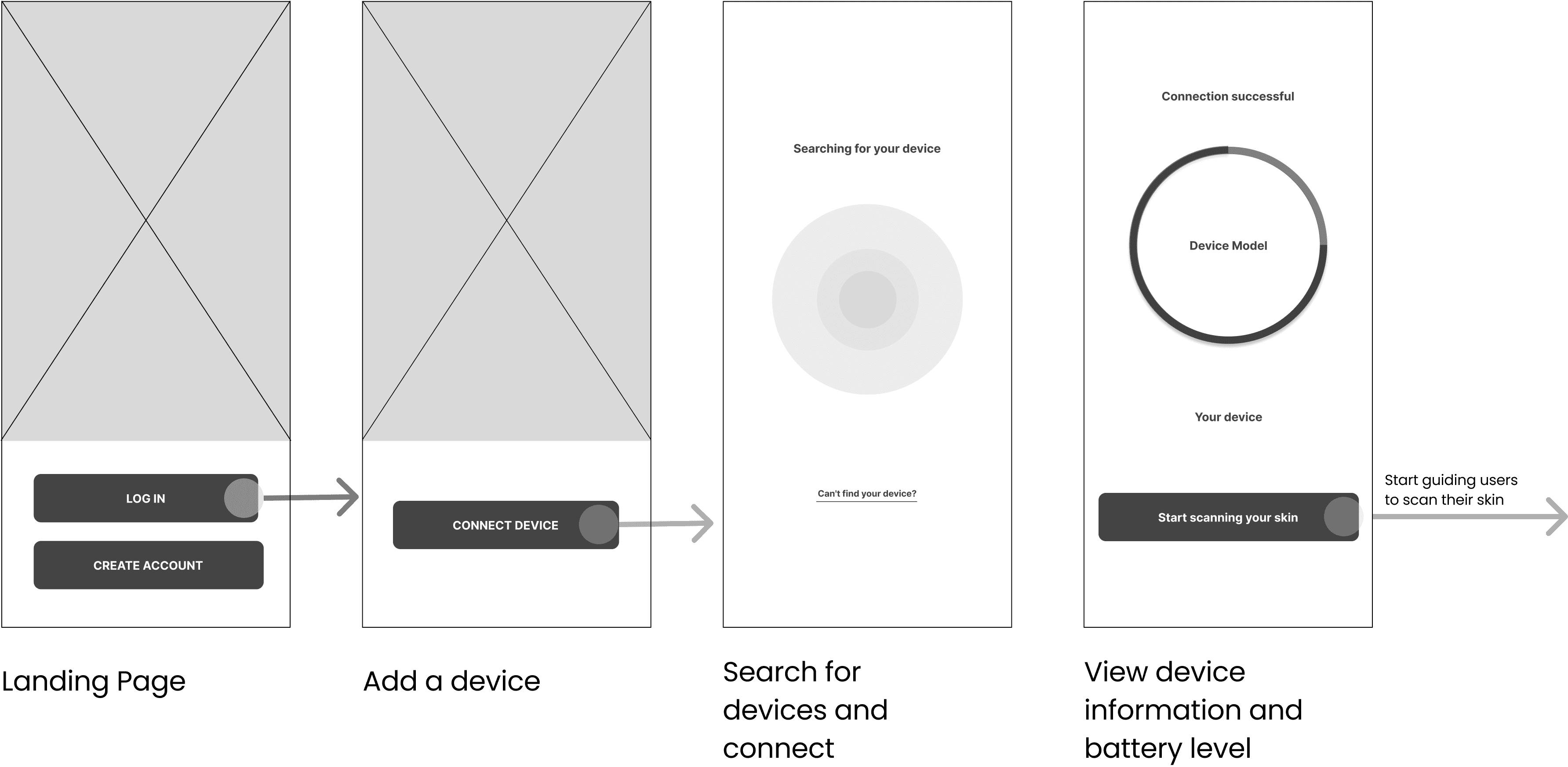
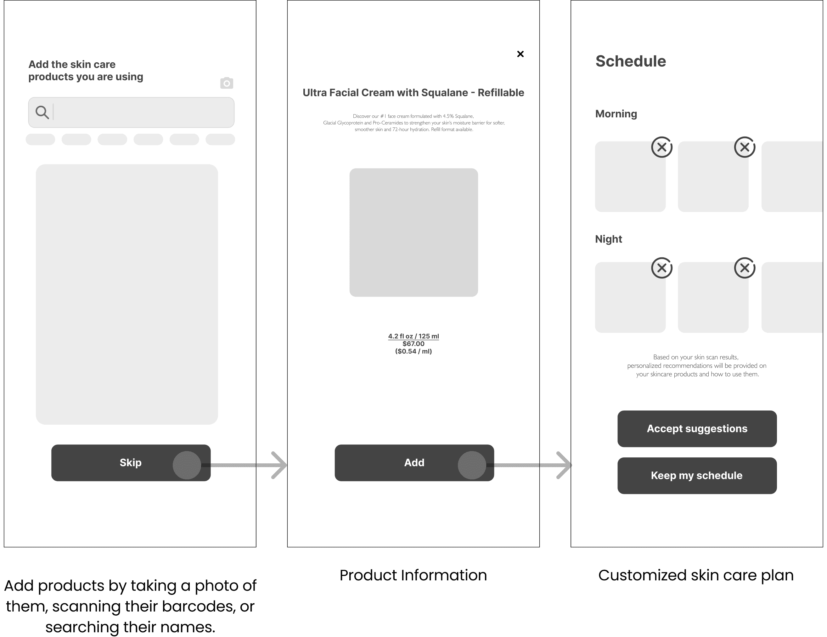
INFORMATION ARCHITECTURE & USER FLOW
SERVICE MODEL CANVAS
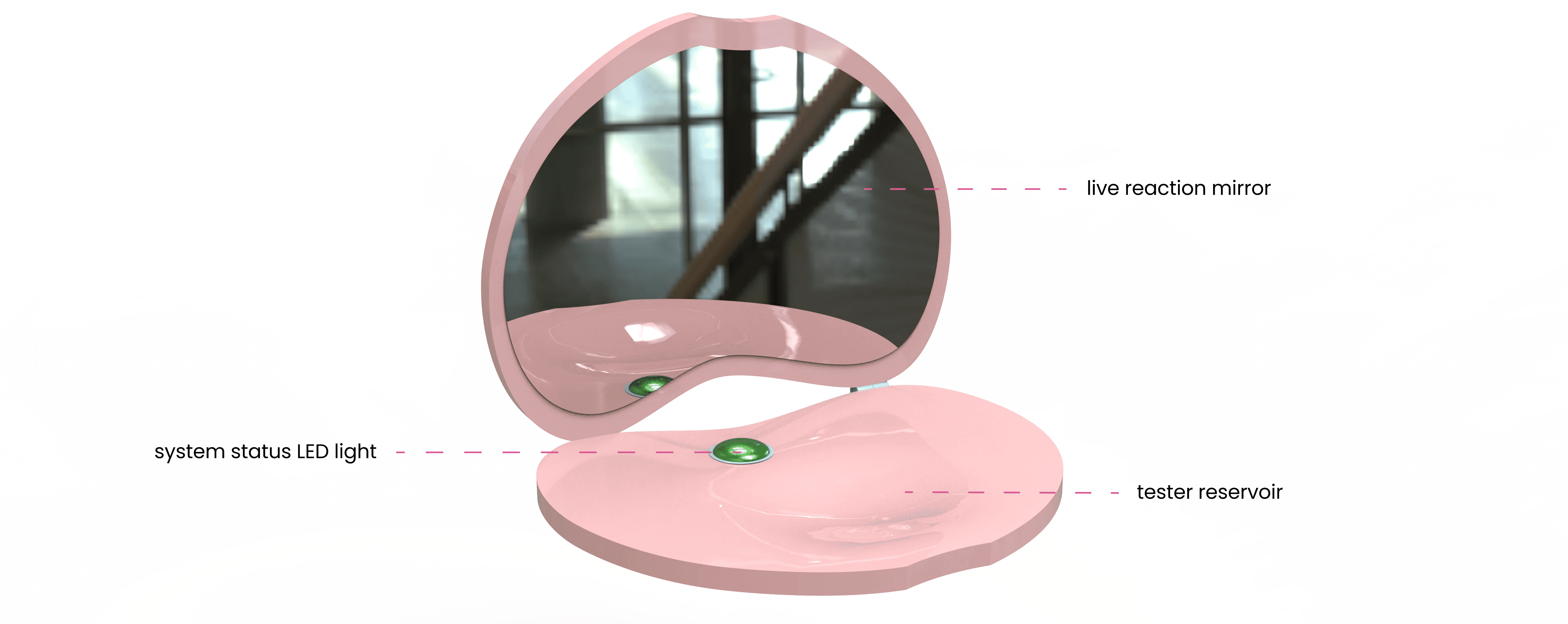
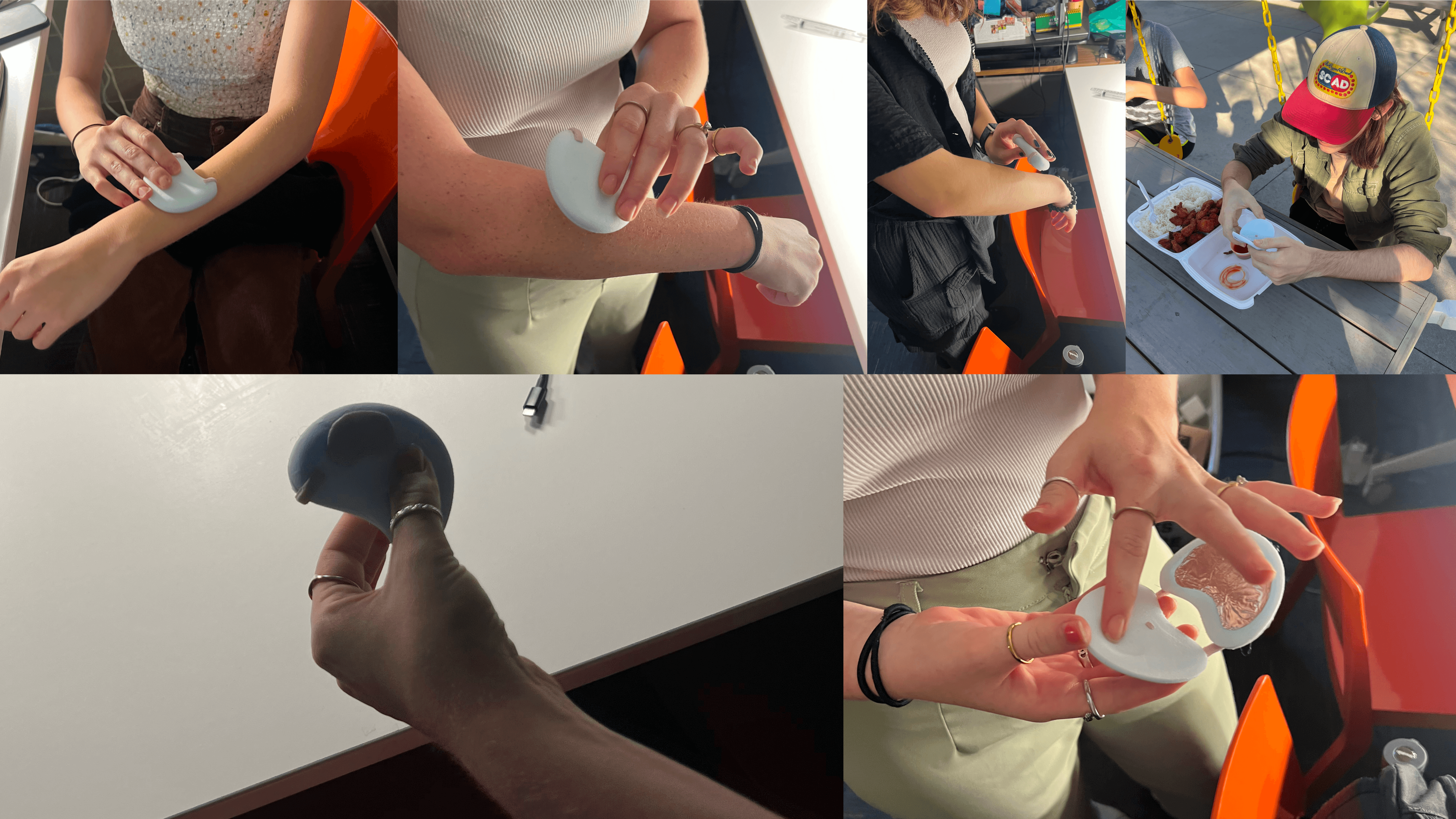
SCANNER DEVELOPMENT
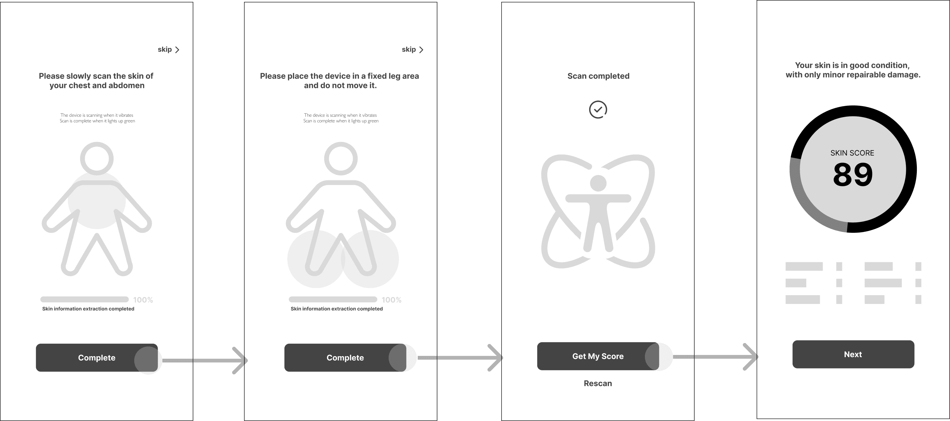
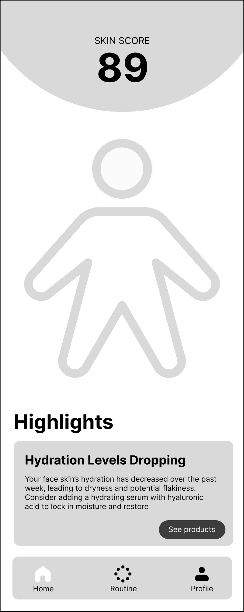
UI DEVELOPMENT
Onboarding
Initial skin scan
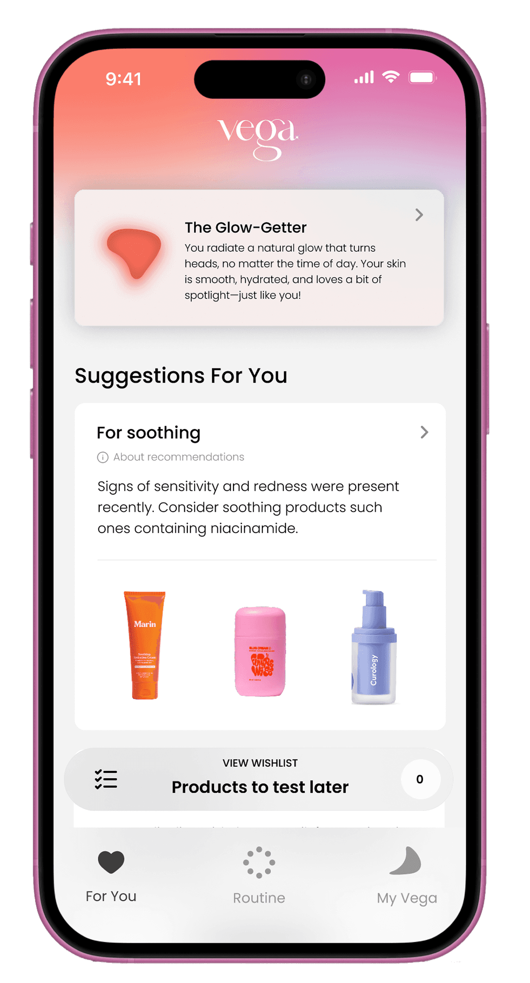
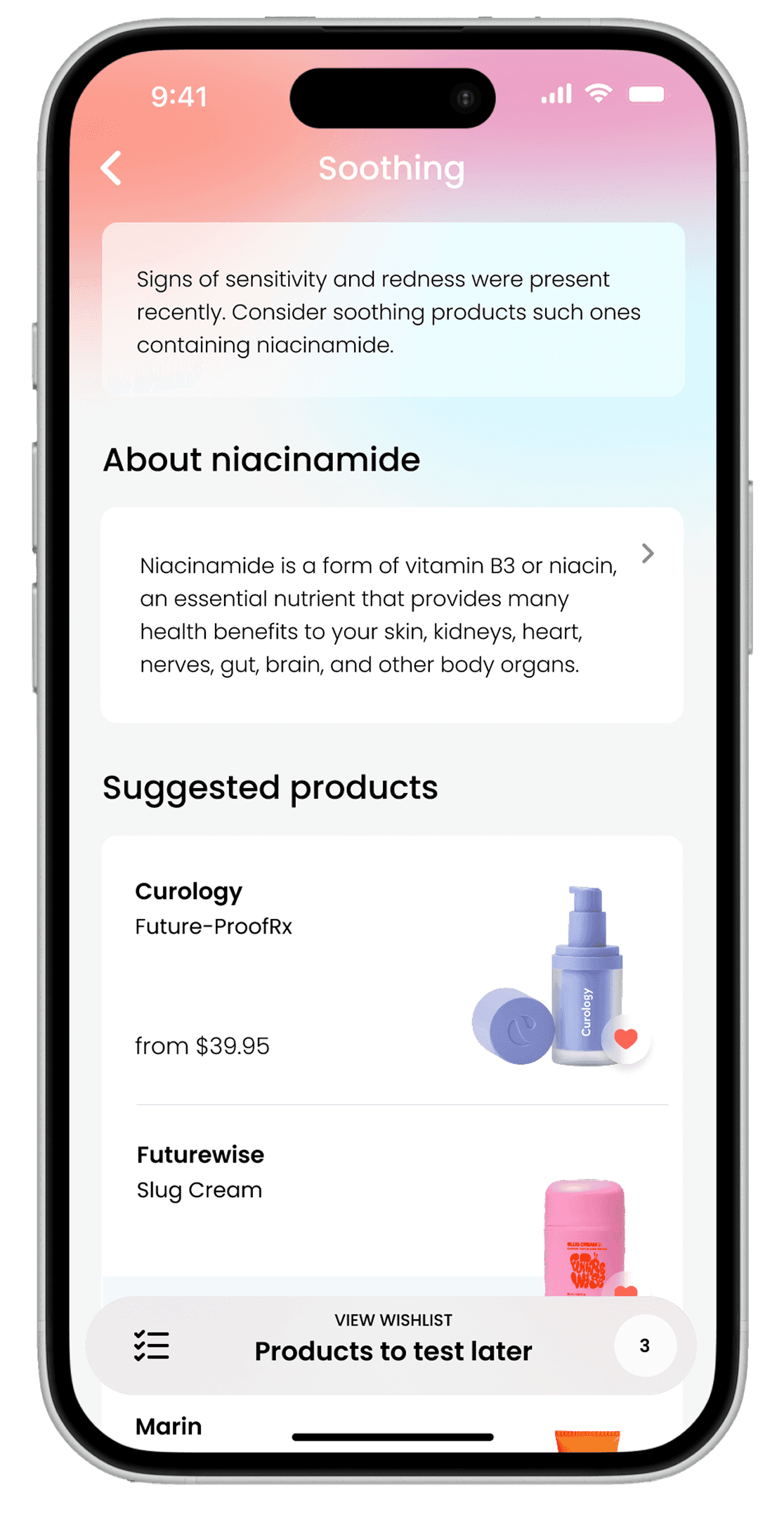
Results and suggested products
Homescreen
MID-FIDELITY SCANNER
INITIAL DIGITIAL PROTOTYPE
MID FIDELITY UI
Onboarding
Initial skin scan
Results and suggested products
Homescreen
Build a routine
User Testing
TESTING RESULTS
Round 1
10%
success
60%
difficulty
Round 2
30%
success
40%
difficulty
Round 3 — Final
70%
success
5%
difficulty
90%
found Vega easy to use and integrate into their routine.
80%
said it would help them make better skincare purchases.
100%
felt more confident in their skincare choices after using Vega.
KEY DESIGN ITERATIONS
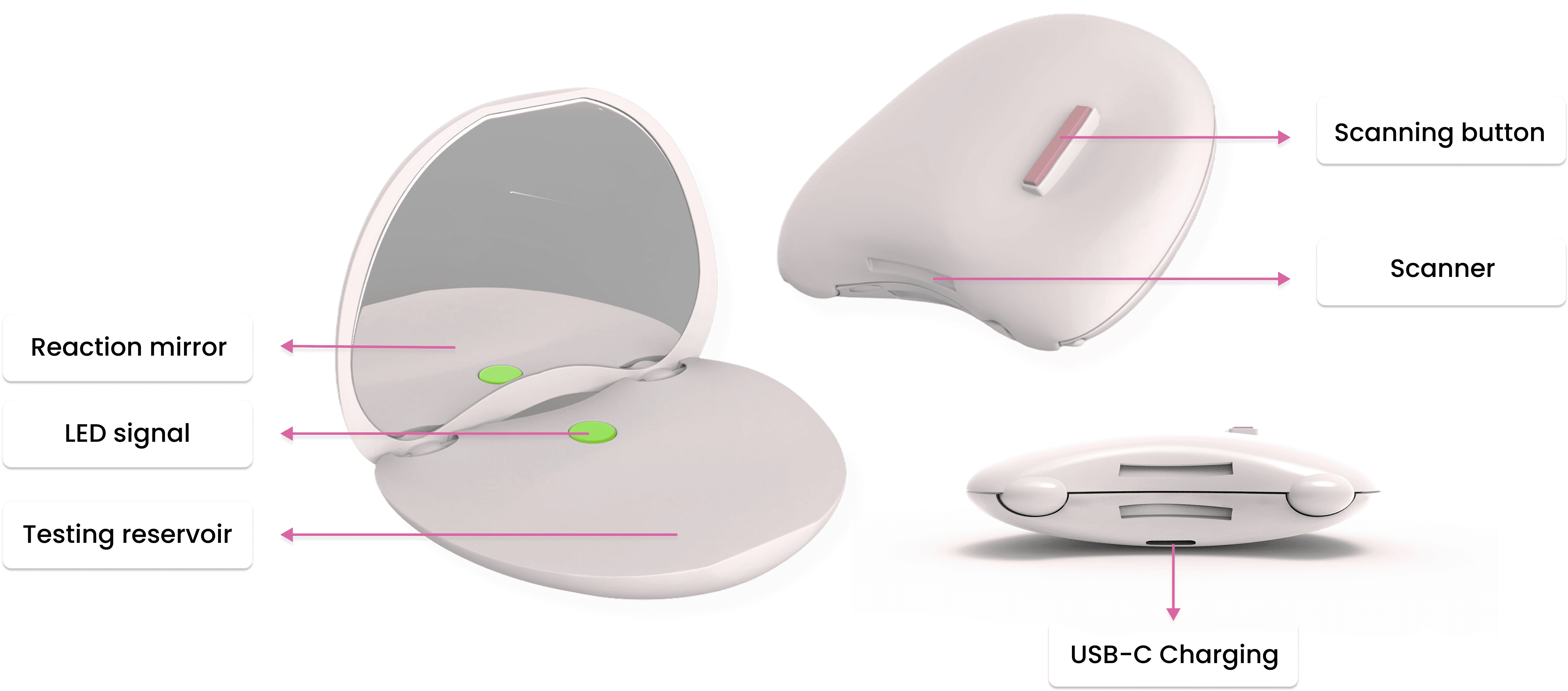
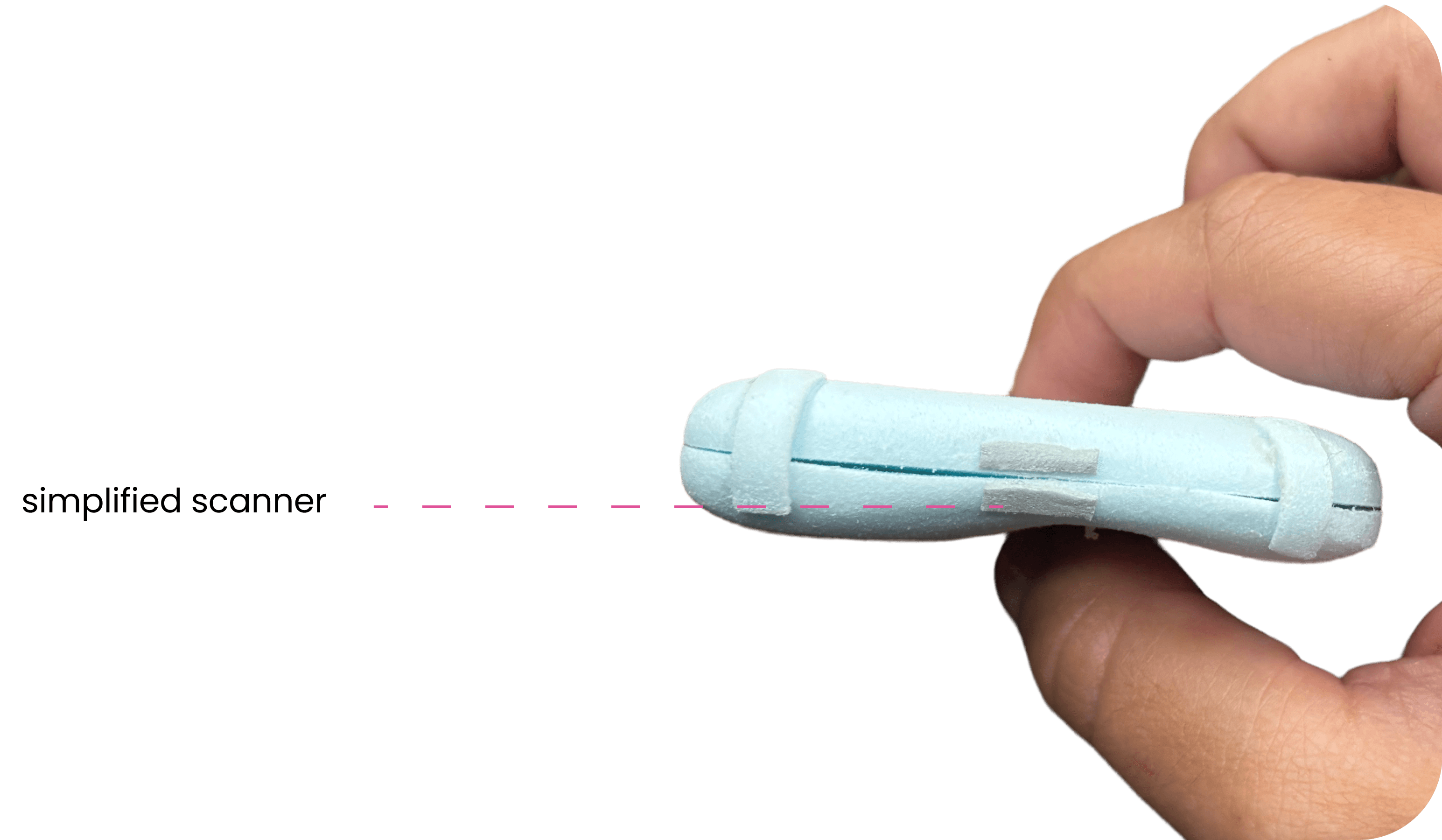
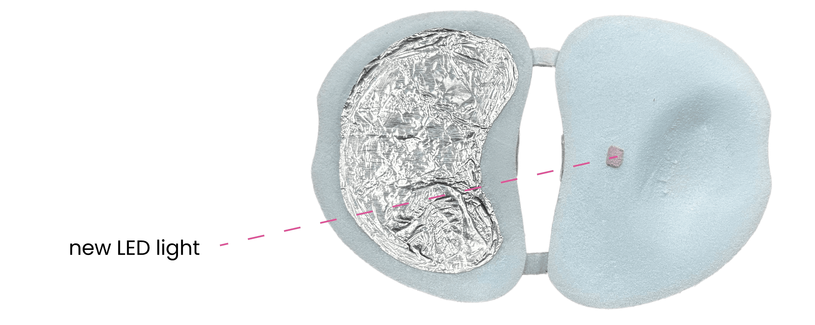
Simplified scanner design to fit gua sha shape
Repurposed trigger button as a system status indicator
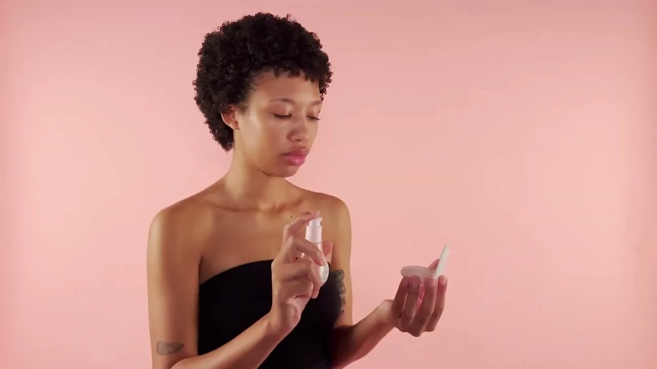
Device will automatically begin analyzing skincare sample once it senses an input
Final Solution
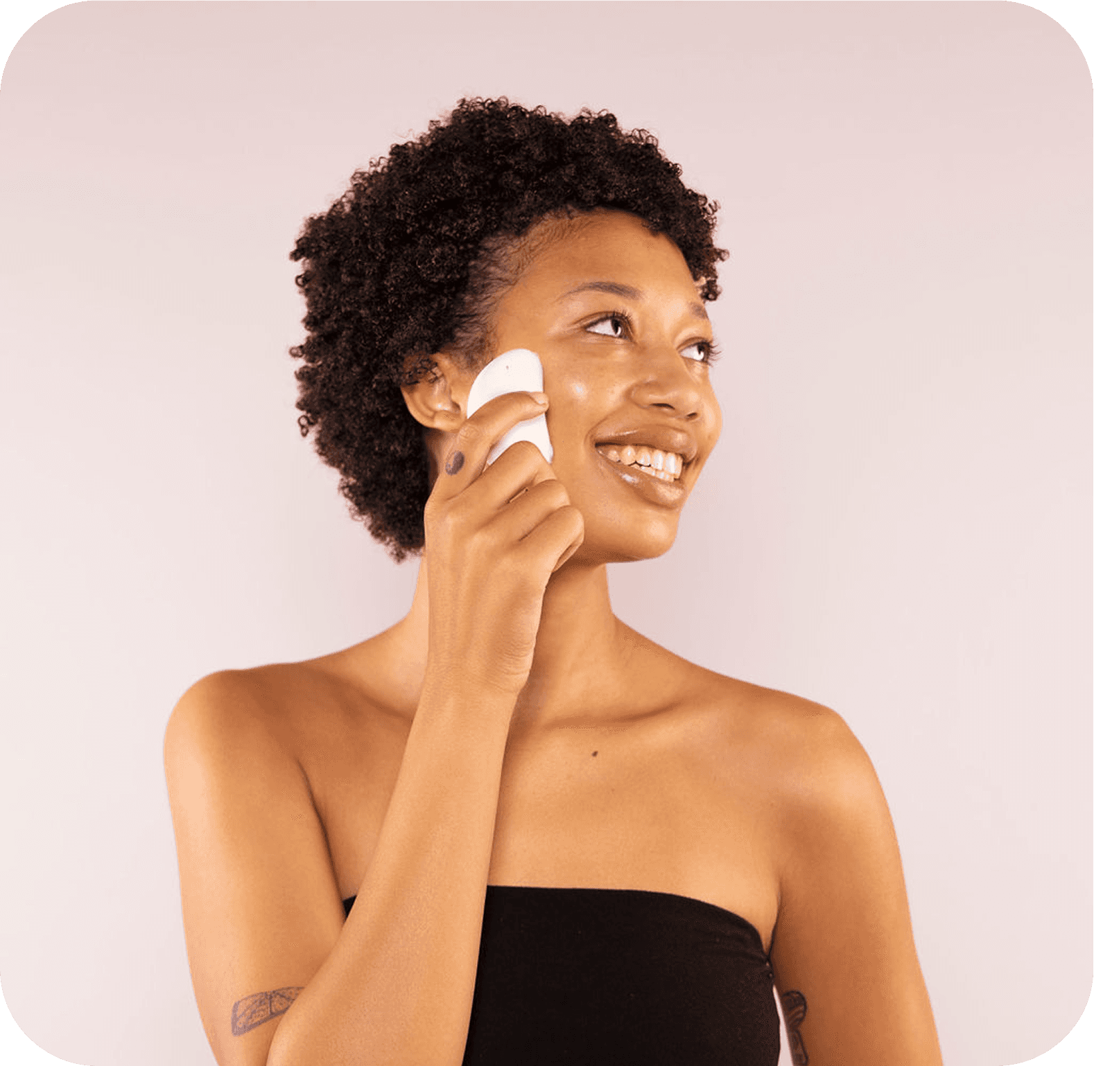
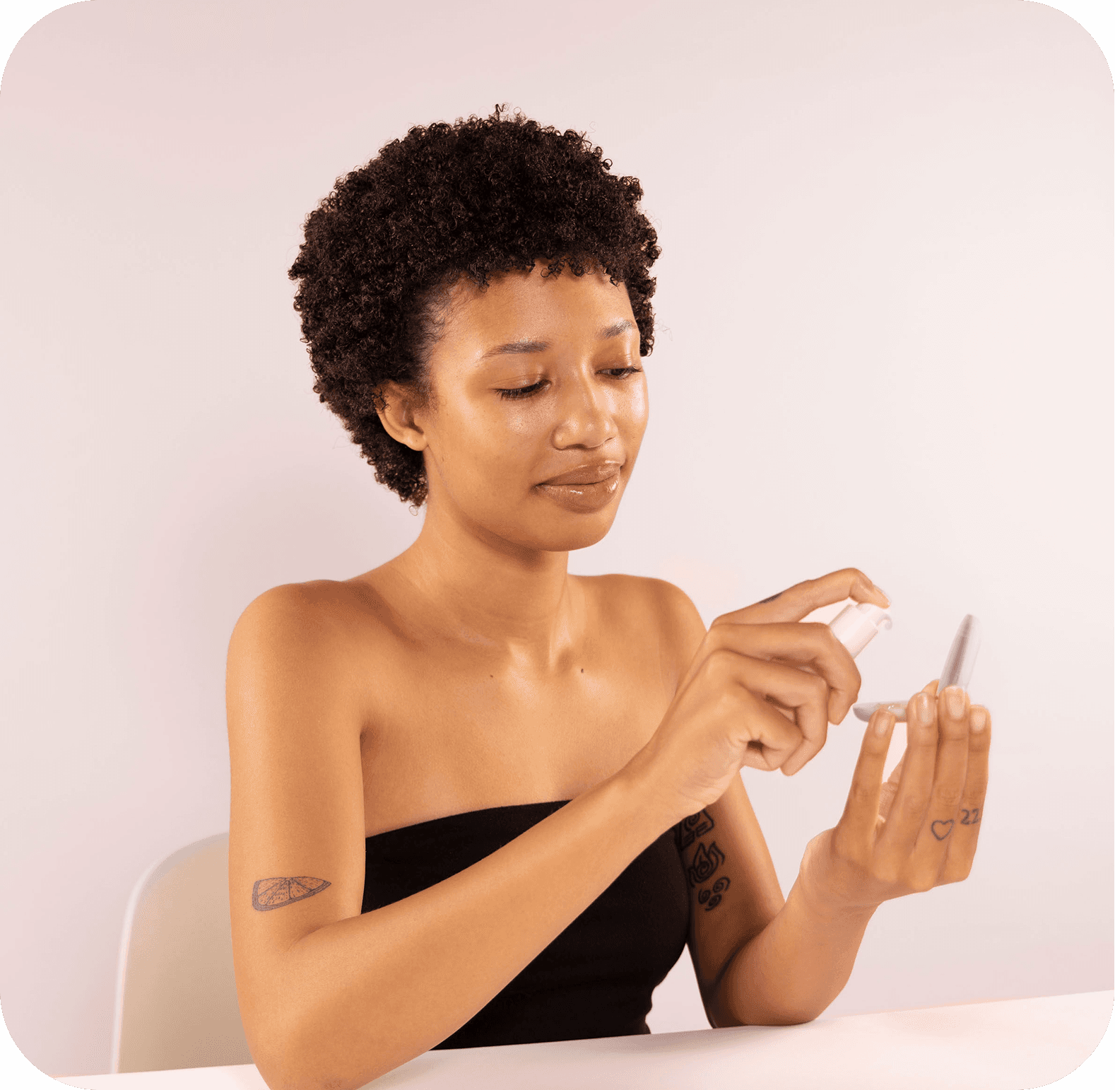
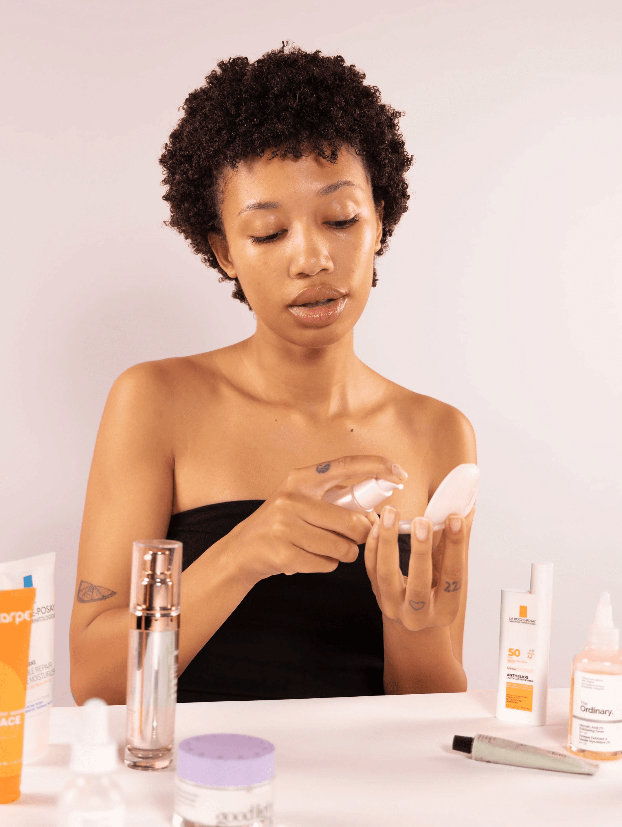
VEGA SCANNER
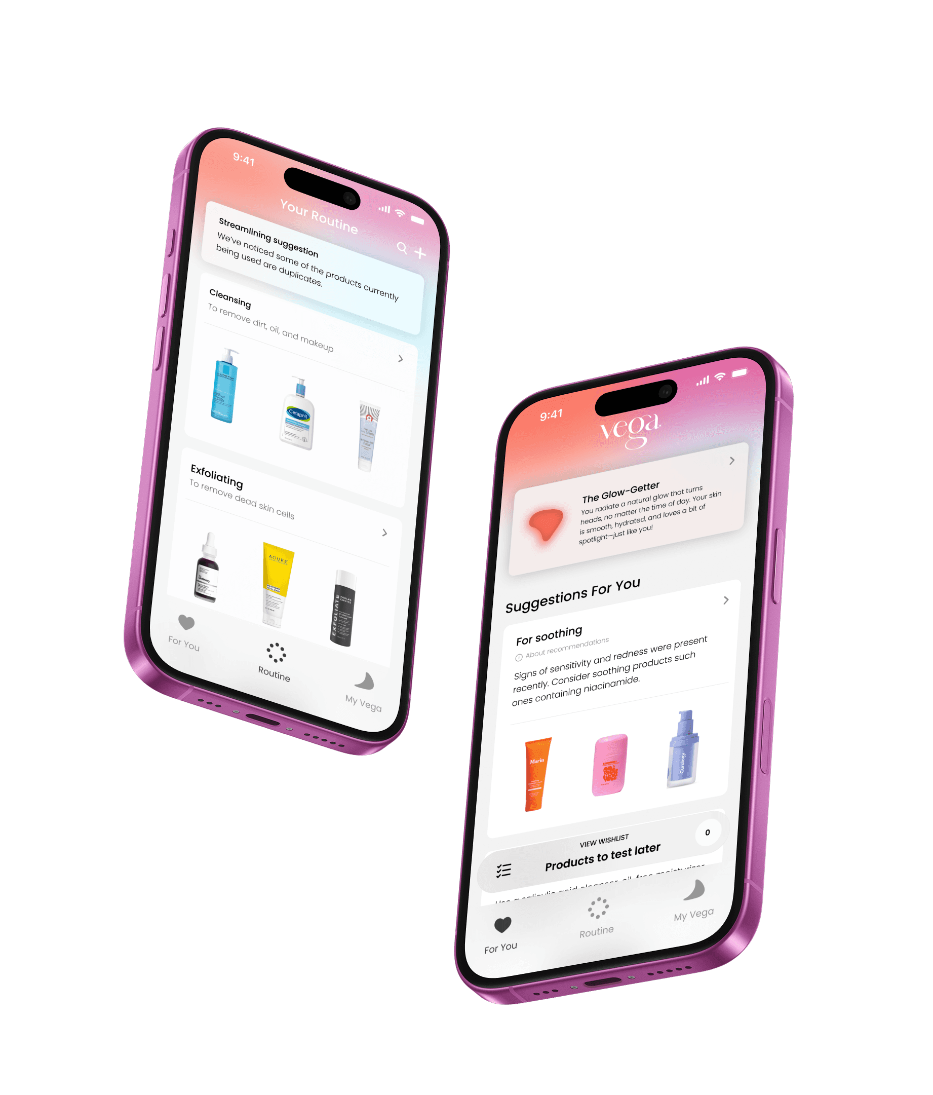
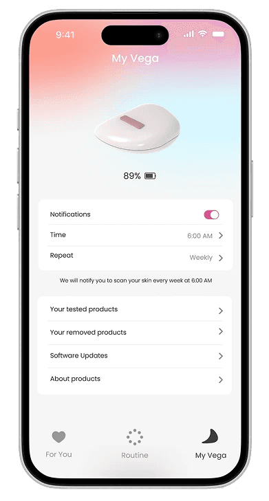
VEGA APP
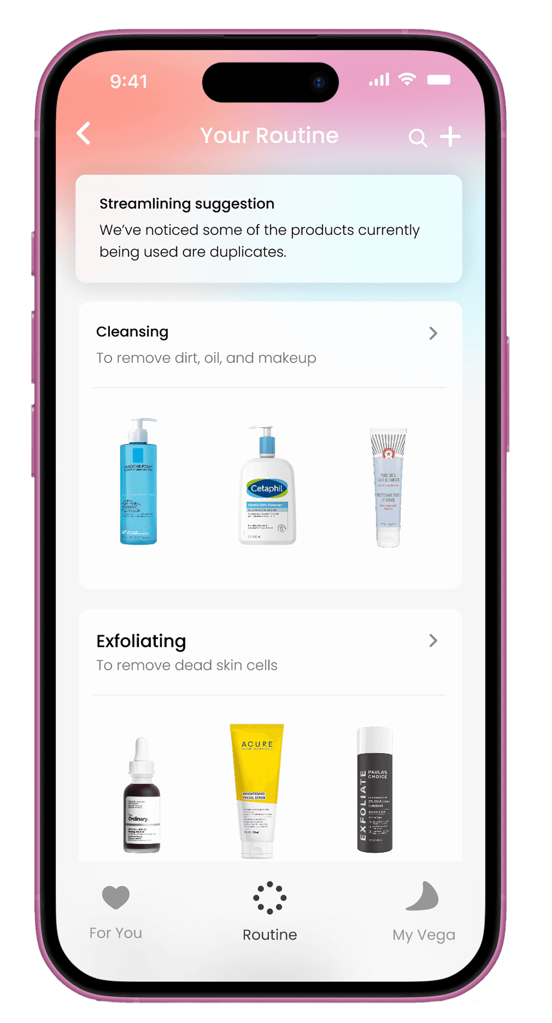
Streamline your routine to keep only what you need
Get what you need for your current skin state
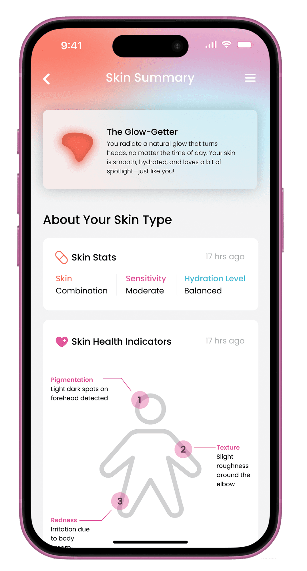
Learn more about what is happening with your skin
Get personalized recommendations from scans
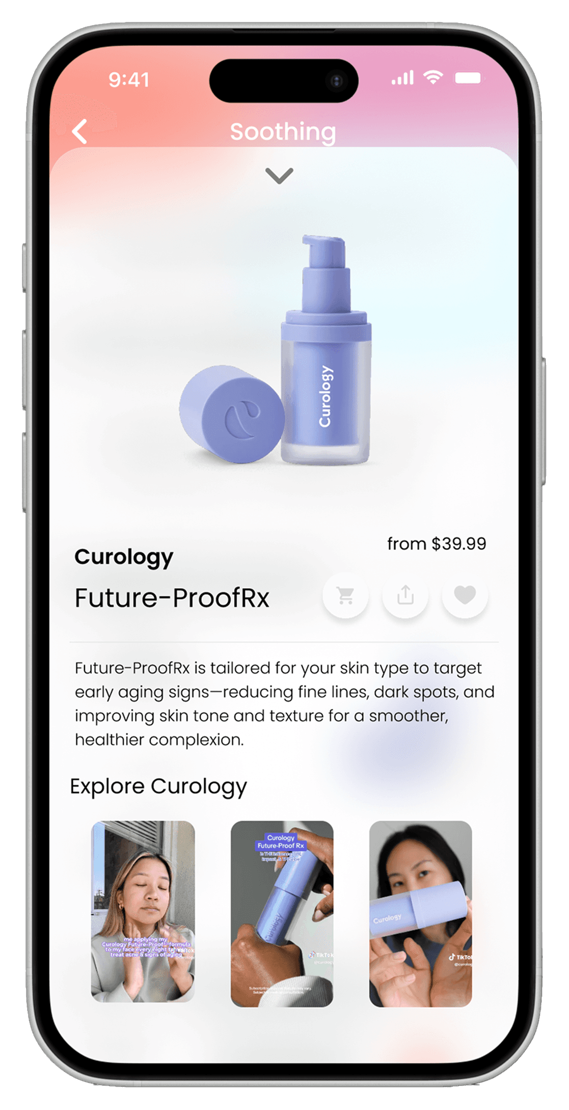
Explore specific products and where to buy
Control the Vega scanner and set up reminders to scan skin
VISION VIDEO
What did we learn?
We have a real winning concept here
Everyone we tested and interviewed was super excited about the concept of personalized skincare matching.
Clear affordances and feedback builds user trust
We learned how crucial it is to design affordances that are intuitive, noticeable, and aligned with user expectations. Form and function can’t be separated.
Users need gentle guidance
Even with a clean app and device, some users still need nudges to know what to do next. We spent longer designing an informative onboarding and product manual to lower the chance of confusion.
