Graphic Design
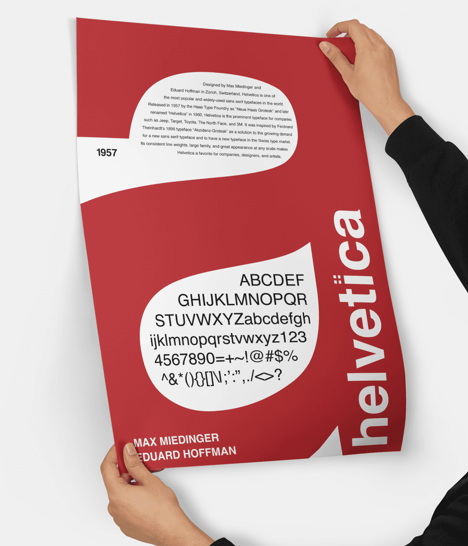
Helvetica (2022)
A tribute to the classic
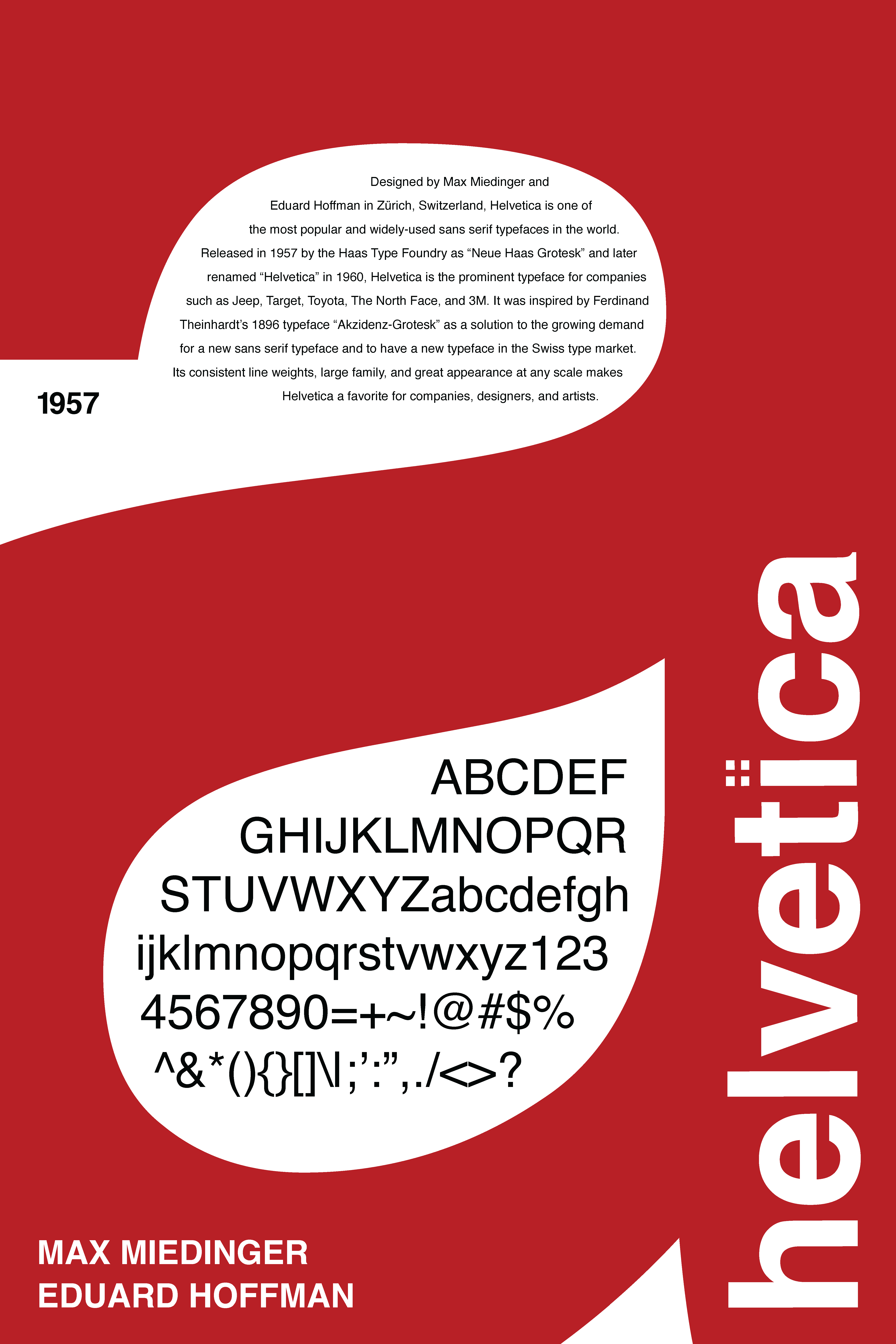
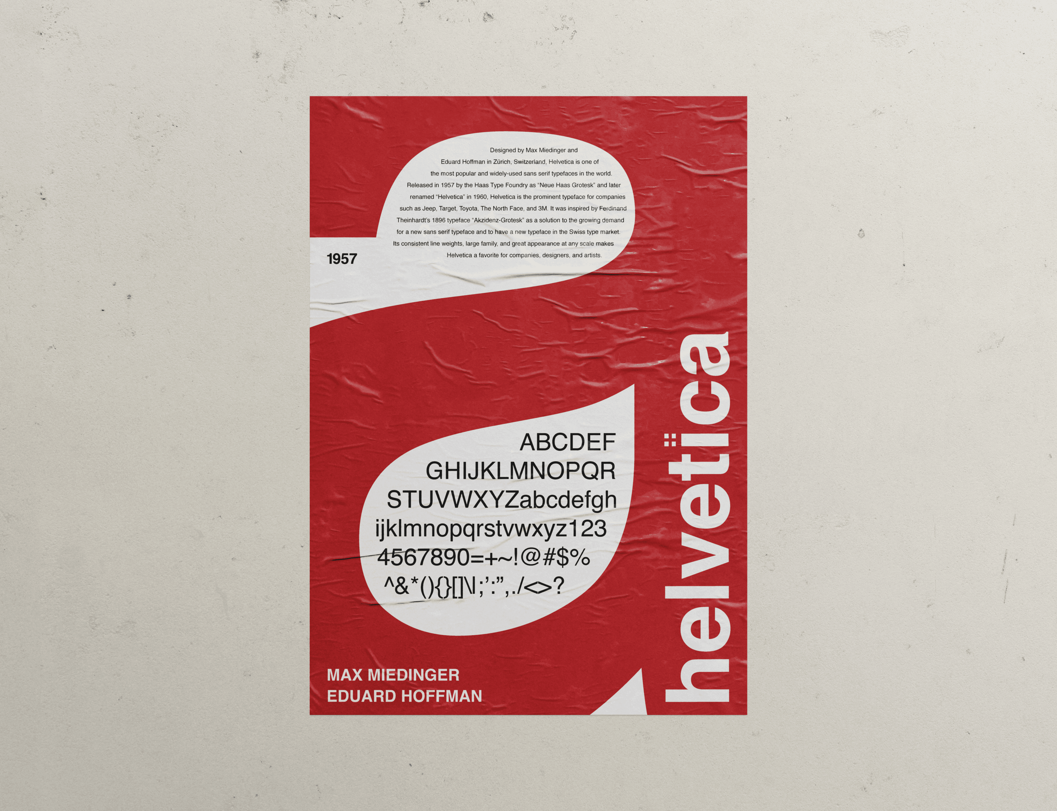
Designed by Max Miedinger and Eduard Hoffman in Zürich, Switzerland, Helvetica is one of the most popular and widely-used sans serif typefaces in the world. Released in 1957 by the Haas Type Foundry as “Neue Haas Grotesk” and later renamed “Helvetica” in 1960, Helvetica is the prominent typeface for companies such as Jeep, Target, Toyota, The North Face, and 3M. It was inspired by Ferdinand Theinhardt’s 1896 typeface “Akzidenz-Grotesk” as a solution to the growing demand for a new sans serif typeface and to have a new typeface in the Swiss type market. Its consistent line weights, large family, and great appearance at any scale makes Helvetica a favorite for companies, designers, and artists.
The composition uses the letter "a" in the Helvetica typeface to create a figure/ground relationship. The bold font family is used for key elements like the "a," creation year, original designers, and typeface name, while the regular family provides contrast for the copy and type specimen. Inspired by Helvetica’s origin country, the colors of the Switzerland flag influence the composition. The design achieves a dramatic ambiance while incorporating elements of Swiss history, such as the "+” shape from the flag integrated into the tittle of the "I."